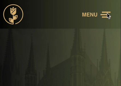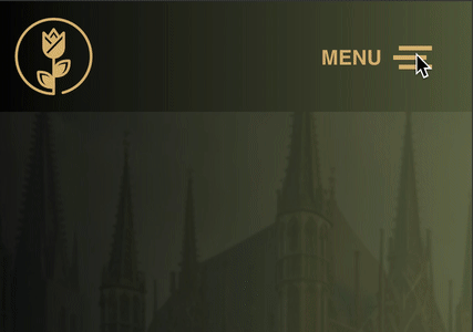
In this Bricks tutorial, I’ll show you how to add text MENU before the hamburger menu toggle used in Bricks and I’ll also show you how to change that text on the close X toggle as well or to remove it altogether.
If you prefer to add the MENU text after, check out this tutorial at Bricks Labs. One thing to keep in mind is that I use a different approach than they do by also targeting the aria-expanded tag rule. You’ll learn more about why I do that as you read through this tutorial. You can view this example on the live site: https://wearereformed.com


1. Edit the Header Template
Go ahead and open the Header template and select the nav element. Under Style, go to CSS -> Customer CSS. This is where you will place the CSS for this at. Copy and paste the CSS below into that section.
%root% .bricks-mobile-menu-toggle[aria-expanded="false"]::before {
    content: 'MENU';
    position: absolute;
    left: -7rem;
    font-weight: 600;
  }
 %root% .bricks-mobile-menu-toggle[aria-expanded="true"]::before {
    content: 'CLOSE';
    position: absolute;
    left: -7rem;
    font-weight: 600;
  }
2. Tweak the CSS
Take note of the aria-expanded false and true. By default the menu is collapsed and is listed as aria-expanded=”false”, so you will want to set the content text for that here. I’ve already set that as MENU for you.
The second part is where the menu is expanded and is listed as aria-expanded=”true”. If you want only the X to appear, remove “content: ‘CLOSE’;“. Otherwise, set the content text to whatever you want. I’ve already set that as CLOSE for you.
If you prefer to have the text after the hamburger toggle but want to implement our version, follow the tutorial I linked to at the beginning but change the selectors to:
%root% .bricks-mobile-menu-toggle[aria-expanded=”false”]::after and %root% .bricks-mobile-menu-toggle[aria-expanded=”true”]::after instead of the CSS selector they provide.
Either way, check out the end result of the version I provided below.